
Print quality starts and ends with the print file. When dealing with printed signs, artwork resolution is an important aspect of getting a great final product. Without the optimal resolution a sign will most likely look grainy or blurry up close. In this blog are going to explain resolution and how to find the optimal resolution for any sign.
Resolution can be thought of as “dots per square inch”. On a computer screen they are pixels and on a print they are literally dots of ink. Every pixel on a computer screen is an LED that can emit red, blue and green light… combining those to create millions of colors. Every dot of ink uses a combination of blue, magenta, yellow and black to create millions of colors.
A computer screen is optimal at 72 dots per square inch (known as dpi) no matter the screen size. It is not the same with print. When it comes to printing signs more dots per square inch means better lines and color fades and shadows because more colors can be used in smaller areas. Below is a basic print resolution chart with guidelines on what resolution is needed for different size signs. These are not hard and fast rules because they do not take into account the original quality of the artwork/photos but they are a good rule of thumb to follow when possible.

As you can see from the chart above, very small signs are optimal at 300+ resolution and as you increase the sign size to a few feet in length you only need a third of that… or around 150-100 dpi. This is because small sings are usually viewed up close, so the sign needs more details. As you view a larger sign from further away less detail is noticeable with the eye, and so we can use a lower dpi. This saves file space and transfer time as every dot of information needs to be coded by the computer.
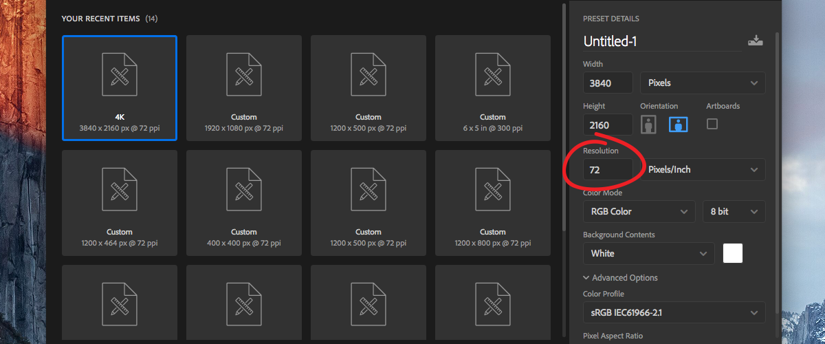
In most Adobe programs there is an option to change your image resolution. This is where you want to reference the above chart and input the optimal resolution before you create your art. Because Adobe illustrator is a “vector” program resolution only comes into play when you save the file for print. We will talk through the differences in Vector vs. Rasterized design programs in a future blog.
If the artwork is going to be printed on a sign you also want to make sure the color mode is set to CMYK. Like I mentioned at the beginning a printer uses 4 colors to create millions of combinations using Cyan, Magenta, Yellow and Black. Using this color mode will help ensure that the print closely matches what you see on your computer screen.

A few things to keep in mind:
Using undersized graphics or photos in your artwork and simply stretching them to be the desired size them will not increase their resolution. The more you enlarge a photo or rasterized element the grainer it will look when printed. You can get a way with some enlargement if the photo/graphic is very sharp to begin this, but avoid stretching whenever possible. We will explain this in detail in another blog post.
The best format to save your art file in for print is .tiff using the LZW compression setting. This file type has the best compression while also keeping the lossless quality. If .tiff is not an option available to you .jpg would be second best. For more information on saving a .tiff using Adobe programs check out the video below!
Here at Wilde Signs we set the bar high by offering our customers superior quality at a competitive price, paired with fast delivery.
Custom sign projects & manufacturing is our specialty. Don’t be overwhelmed by creating a solution on your own. Pass your projects off to us and we will see it through to outstanding results–beginning to end.
The Wilde Signs Promise You will receive an end product that you are happy with or we will make it right.
Leave A Comment